Yarn
User Documentation
Yarn — Yet Another Retirement Number. A complete reference to the inputs, methodology, and results of the retirement simulation. Understanding this documentation will help you get the most out of the tool — and interpret its output correctly.
Introduction

This simulator aims to answer a fundamental retirement question: given my current savings, spending plans, and market history, am I able to comfortably retire? Rather than making assumptions about the future, the tool replays your retirement scenario against every historical period in US market history — from the panic of 1907 to the dot-com crash to 2008 — and counts how often your plan would have survived.

The approach is known as historical backtesting. It does not predict what markets will do in your lifetime. What it does do is show you how your plan would have fared under all historical market conditions the US has ever experienced, giving you a realistic picture of the risk you are taking on. Obviously, if in the future we experience a larger stock market crash than ever seen before, this simulator will not predict it: it can only project based on what has happened previously.

This documentation explains every input field, every result tile, and the methodology behind the numbers. Because retirement planning decisions are consequential, we encourage you to read the Caveats & Limitations section before acting on these results.

How the Simulation Works
Historical Market Data

The simulator uses the Shiller dataset, which records US stock market returns and inflation going back to 1871. This gives roughly 150 years of monthly data covering many complete market cycles: booms, crashes, recessions, high-inflation periods, and long periods of low growth.

All returns in the model are real (inflation-adjusted). When the simulator says your portfolio grew to $X, that $X has the same purchasing power as today's dollars. This means the simulation already accounts for inflation eroding your savings — you do not need to add an inflation adjustment separately.

The Shiller dataset also includes the CAPE ratio (Cyclically-Adjusted Price-to-Earnings ratio, also known as the Shiller PE). CAPE is used to assess current stock market valuations and adjust success rate estimates accordingly. CAPE is only used in one subsection of the results; the main part is not reliant on CAPE.

Retirement Scenarios

Each simulation run creates many independent "paths" — one for each possible historical starting month. There is more than 100 years of data, leading to more than 1200 simulated paths, each experiencing a different sequence of returns. The simulation then counts how many paths survived (did not go bankrupt before the retiree died) to compute a success rate.

For each path, the simulator runs a month-by-month loop:

  1. Add cash flows — any income (Social Security, pension) or expenses (mortgage, tuition) scheduled for this period are added to or subtracted from the portfolio.
  2. Update allocation — if you have set up a dynamic asset allocation strategy (a "bond tent"), the portfolio is rebalanced to the target allocation for this period.
  3. Withdraw — the planned withdrawal for living expenses is deducted. The chosen withdrawal method determines how much this is.
  4. Apply returns — the portfolio grows (or shrinks) according to the historical returns for this period.
  5. Check for bankruptcy — if the portfolio value falls below zero, the path is marked as bankrupt. If a reverse mortgage is available, it may rescue the path first.
Mortality Modeling

The simulation uses standard actuarial mortality tables to model the probability of dying at each age. Rather than assuming everyone lives to a fixed age, each path is sampled against the mortality distribution: some paths end at 72, others at 89, others at 101. This creates a realistic spread of retirement durations.

Mortality matters because a retirement that "fails" at year 35 of retirement is not actually a failure if you are almost certain to have died by then. The success rate reported in the results already accounts for your actual probability of living that long. A retirement that only fails in scenarios where you would live past 100 has a much higher real-world success rate than the raw numbers might suggest.

Input Reference

Below is a detailed description of every input field in the simulator. Fields marked conditional only appear when certain other settings are active. Fields marked optional can be left blank.

01 Retirement Timing

This section establishes when you retire and what accumulation phase looks like before then.

Current Age required
Your age today, in years. This anchors the mortality table — the simulator looks up how likely someone of your age is to survive each subsequent year.
Timing required
Three options:
  • Retired / Retire Now — you are already retired, or retiring immediately. The simulation begins at step zero with your current portfolio.
  • Specific Month or Year — you plan to retire at a particular date. The simulator adds your annual savings to the portfolio each period until that date. Your portfolio will also of course fluctuate up and down with the markets during this accumulation phase.
  • Specific Portfolio Value — you plan to retire when your portfolio hits a target number. The simulator adds savings each period, in addition to regular market fluctuations, until the threshold is crossed.
Target Retirement Month / Year conditional
Visible when Specific Month or Year is selected. Set this to your expected retirement date. Must be in the future.
Target Portfolio Value conditional
Visible when Specific Portfolio Value is selected. The simulation saves toward this number and begins the retirement phase once it is reached. Must be greater than your current portfolio value.
Annual Saving Amount conditional optional
How much you add to your investment portfolio each year during the pre-retirement saving phase. Include your 401(k) contributions, IRA contributions, and any other retirement savings. If you are not currently saving, leave this at zero.
Annual Saving Increase conditional optional
How much you expect your annual saving amount to grow each year, expressed as a percentage. This is a rough estimate, and only important if your retirement date is very far away. This, as all other numbers, is in excess of inflation. That is, if you plan to increase your saving amount with inflation, leave this at zero.
02 Net Worth

Your current financial position — the starting point for the simulation.

Current Portfolio Value required
The total current market value of your investment portfolio: brokerage accounts, 401(k), IRA, etc. Do not include your home equity here — that goes in the home value field below. If you have significant amounts in checking or saving accounts, include them in the 'cash' category.
Equities (%) required
The percentage of your portfolio currently invested in stocks and equity funds. The model uses the S&P 500 as the proxy here. (If you are heavy on individual companies, this simulator won't work for you, as it can't track the performance of individual companies, only the market as a whole.)
Bonds (%) required
The percentage currently in bonds and bond funds. The proxy here is the US 10year Treasury Bond. Equities + bonds must not exceed 100%. Whatever remains is assumed to be in cash or cash equivalents (money market, savings, etc.).
Own Your Home? optional
Check this if you own your home and would consider using its equity as a last resort in retirement. If your investment portfolio reaches zero, the simulation will model a simple reverse mortgage: drawing down 40% of your home value to keep the retirement alive. This counts as an "RM Rescue" success, not a full success, since a retirement that involves such decisions is not particularly pleasant for the retiree.

If you would prefer not to rely on your home equity (perhaps because you intend to leave it to heirs, or would rather move to a rental at that point), leave this unchecked and a portfolio reaching zero will be counted as bankruptcy.
Home Value conditional
The current market value of your home. Appears when "Own your home?" is checked. The reverse mortgage model uses 40% of this figure as the rescue amount — a conservative estimate of the equity you could access.
03 Withdrawals

How you plan to draw money from your portfolio in retirement. Different strategies involve very different trade-offs between predictability and efficiency.

Withdrawal Method
Fixed Amount
You withdraw the same dollar amount every year. This is the most predictable strategy — your spending never changes. However, it is the least adaptive: a bad market sequence will drain the portfolio without the withdrawal ever adjusting downward, potentially leading to bankruptcy. All amounts in this simulator are inflation-adjusted, so "fixed" means fixed in real purchasing power terms, not nominal dollars.
Fixed Percentage
You withdraw a fixed percentage of the current portfolio value each year (e.g. 4%). Your spending fluctuates with market performance — you spend more in good years and less in bad years. This strategy can never cause bankruptcy in the pure mathematical sense (you can always withdraw 4% of something), but it can lead to very low spending in bad markets and does not guarantee a comfortable retirement income. The spending floor (below) can protect against this.
VPW — Variable Percentage Withdrawal
A more sophisticated variable strategy that determines the withdrawal percentage based on your age and expected remaining retirement horizon. The withdrawal percentage increases each year as you age, ensuring the portfolio is drawn down roughly to zero at the end of your expected life. This is more efficient than fixed percentage in the sense that it tries to avoid leaving a large unspent portfolio at death, while still protecting against outliving your savings. The full VPW methodology suggests purchasing a Single Premium Immediate Annuity (SPIA) at age 80, to protect against the 'risk' of living past 100. This model can not simulate that, so you should consider such possibilities separately. See the Bogleheads VPW wiki for full methodology details.
CAPE-Based Withdrawal
Withdrawal is calculated as a fraction of portfolio value, with the rate adjusted based on the current CAPE ratio. The formula is:

Withdrawal Rate = a + b / CAPE

where a is a base rate and b scales how much the CAPE level shifts the rate. When CAPE is high (expensive market), you withdraw a lower percentage; when CAPE is low (cheap market), you withdraw a higher one. This is a research-based adaptive strategy designed to respond to market valuations. See Early Retirement Now — Part 18 for the research behind this approach.
Guyton-Klinger Guardrails
A rules-based adaptive method originally designed by Jonathan Guyton and William Klinger. You begin with a fixed initial withdrawal amount (like the Fixed Amount method), but each year the guardrail rules may raise or lower it based on your current withdrawal rate relative to the rate you started with:

Capital Preservation Rule — If your current withdrawal rate has risen more than the Upper Guardrail percentage above your starting rate (e.g. from 4% to above 4.8% with a 20% guardrail), and you have more than 15 years remaining, your withdrawal is cut by the Adjustment percentage (e.g. 10%).

Prosperity Rule — If your current withdrawal rate has fallen more than the Lower Guardrail percentage below your starting rate (e.g. from 4% to below 3.2% with a 20% guardrail, because the portfolio has grown), your withdrawal is raised by the Adjustment percentage, up to but never exceeding the original starting amount.

The rules fire once per year (at each annual boundary), so your spending adjusts gradually rather than month-to-month.

Important note on real-terms simulation: This simulator works entirely in inflation-adjusted (real) terms — all portfolio values and returns already account for inflation. The original Guyton-Klinger system includes a third rule (the "Inflation Rule") which skips the annual cost-of-living raise in bad years; since there is no nominal raise to skip in a real-terms model, this rule is not applicable here and is not implemented. The two guardrail rules above are the core of the strategy.

The typical defaults — 20% upper guardrail, 20% lower guardrail, 10% adjustment — are a widely-cited starting point. See Early Retirement Now — Part 9 for a detailed analysis.
Additional Withdrawal Settings
Annual Withdrawal Amount conditional
The dollar amount to withdraw per year. Appears when Fixed Amount or Guyton-Klinger Guardrails is selected. For Guyton-Klinger, this is the initial amount — the guardrail rules may raise or lower it over time, but can never raise it above this figure. Expressed in today's dollars (the simulation adjusts for inflation automatically).
Annual Withdrawal Percentage conditional
The percentage of the current portfolio to withdraw each year. Only appears when Fixed Percentage is selected. A commonly cited benchmark is 4%, which has historically been close to the maximum sustainable withdrawal rate for a 30-year retirement. For longer retirements (early retirees), 4% can be risky. Higher percentages mean higher spending but also higher failure risk.
CAPE Parameters (a and b) conditional
Two separate fields for the base rate a and the CAPE coefficient b. Only appears when CAPE-Based Withdrawal is selected. The formula is Withdrawal Rate = a + b / CAPE. Defaults are a = 0.02 (2% base rate) and b = 0.5, which gives roughly 3.4% at a CAPE of 36. A dynamic preview below the fields shows the current implied withdrawal rate using today's live CAPE value.
Guyton-Klinger Guardrail Parameters conditional
Three parameters that control the Guyton-Klinger guardrail rules. Only appear when Guyton-Klinger Guardrails is selected.

Upper Guardrail (%) — If the current withdrawal rate exceeds the starting rate by more than this percentage, the Capital Preservation Rule cuts spending by the Adjustment amount. Default: 20%. Example: starting at 4%, if the portfolio shrinks enough that you're now withdrawing at 4.8% or more (20% above 4%), the cut fires.

Lower Guardrail (%) — If the current withdrawal rate falls below the starting rate by more than this percentage, the Prosperity Rule raises spending by the Adjustment amount (up to the original amount). Default: 20%. Example: starting at 4%, if the portfolio has grown such that you're now withdrawing at 3.2% or less (20% below 4%), the raise fires.

Adjustment (%) — The percentage by which the annual withdrawal is raised or cut when a guardrail triggers. Default: 10%.
Minimum Annual Withdrawal (Spending Floor) optional conditional
For variable withdrawal methods (Fixed Percentage, VPW, CAPE-based), this sets the minimum you will withdraw each year regardless of what the formula suggests. If the formula produces a number below this floor, the floor is used instead.

This is useful when you have non-negotiable fixed expenses (mortgage, medical bills, basic living costs). The floor ensures the simulation does not produce unrealistically low spending in bad market scenarios — but it also increases failure risk, because you are committing to a minimum spend even when the portfolio has fallen.

While this field is marked as 'Optional', it is highly recommended that you set a reasonable value here if using a percentage-based withdrawal methodology, as no one can live on arbitrarily small withdrawals.
04 Additional Cash Flows

Regular income or expense items that supplement (or offset) your portfolio withdrawals. Up to 10 cash flows can be entered.

Sign convention: Positive amounts are income (money coming in), negative amounts are expenses (money going out). A Social Security payment of $2,000/month would be entered as +2000. A recurring medical expense of $500/month would be -500.
Cash Flow Name optional
A label for your own reference, such as "Social Security" or "Part-time consulting". Not used in the calculation.
Monthly Amount required per row
The monthly amount of this cash flow. Positive for income, negative for expenses. This is the monthly figure — a $24,000/year pension would be entered as 2000.
Start Month / Year required per row
When this cash flow begins. For a pension starting at 65, set this to the month and year you turn 65.
Perpetual optional
Check this if the cash flow lasts indefinitely (no end date). Appropriate for Social Security, defined-benefit pensions, or permanent annuity income. When checked, the end date field is hidden.
End Month / Year conditional
When this cash flow stops. Required if Perpetual is unchecked. Useful for time-limited income or expenses — for example, a mortgage that ends in 2029, or part-time consulting income until age 68.
Cost-of-Living Adjusted (COLA) optional
Check this if the cash flow keeps pace with inflation. Social Security is COLA-adjusted by law. Most government pensions are as well. Private pensions and fixed annuities are usually not.

Because all returns in this simulator are real (inflation-adjusted), a COLA-adjusted cash flow retains its full purchasing power across all simulated years. A non-COLA-adjusted cash flow shrinks in real terms over time.

Common examples: Social Security (positive, perpetual, COLA); a defined-benefit pension (positive, perpetual or to your death, may or may not be COLA); a mortgage that ends in a few years (negative, not perpetual, not COLA); a rental property income (positive, perpetual, not COLA); planned large expenses like college tuition (negative, 4-year window, not COLA).

05 Advanced Asset Allocation

This section allows you to model a dynamic asset allocation strategy — one that changes your mix of stocks, bonds, and cash over time, rather than holding a fixed allocation. This is entirely optional; most users can skip it and use the allocation set in §2.

For experienced investors: Dynamic allocation strategies can be powerful tools but add significant complexity. If you are unfamiliar with bond tents, glide paths, or dynamic allocation theory, we recommend leaving this section disabled and using a single fixed allocation.
The Bond Tent Concept

A bond tent is a common strategy where you temporarily shift to a more conservative (bond-heavy) allocation around the retirement date to reduce sequence-of-returns risk — the danger that a bad market right at the start of retirement will permanently damage your portfolio. After a few years into retirement, you gradually shift back to a more equity-heavy allocation.

The shape is like a tent: start with moderate equities, increase bond allocation leading into retirement (the rise), hold the conservative peak at retirement, then glide back toward equities (the fall).

Use a Dynamic Asset Allocation Strategy
Master toggle. When unchecked, all fields in this section are hidden and the allocation set in §2 is used for the entire simulation.
Begin Allocation Shift (Month / Year) conditional
When the pre-retirement allocation shift should begin — i.e., when you start building the tent. Only shown when you have a future retirement date (Timing §1 = "Specific Month/Year" or "Specific Portfolio Value").
Months to Build conditional
How long the pre-retirement allocation shift takes — from your starting allocation to the tent peak allocation. Only shown when you are retiring at a target portfolio value. For example, if you set Begin Allocation Shift to 5 years before retirement and set Build to 36 months, the shift from your current allocation to the peak allocation will take 3 years, completing 2 years before retirement.
Peak Allocation — At Retirement conditional
The allocation you hold at the moment of retirement — the peak of the tent. Typically this is your most conservative allocation: lower equities, higher bonds. From this point, the glide phase begins and allocation shifts back toward equities over time.
Months to Glide
How long the post-retirement glide from the tent peak to the long-run final allocation takes. For example, setting this to 60 months (5 years) means that 5 years into retirement you will have fully transitioned to your final allocation. A longer glide gives more gradual, smoother transitions.
Long-Run Final Allocation
The allocation you settle into for the long run of retirement, after the glide phase completes. Many strategies end up more equity-heavy than the tent peak — for example, shifting from a 40% equity / 50% bond peak to a 60% equity / 30% bond final allocation.
06 One More Year

The One More Year analysis runs a parallel simulation in which you work for exactly one additional year before retiring, then compares the results to your base scenario. It answers the common pre-retirement question: "If I worked just one more year, how much would it improve my retirement prospects?"

This adds very little to simulation time and produces its own full results section (§3.3 in the results page).

Perform One More Year Analysis
When checked, a second retirement scenario is simulated starting 12 months later than your primary scenario. The extra year uses the same historical return sequence, offset by one year. Results are presented side-by-side in the §2.5 One More Year section.
Amount Saved During the Extra Year optional
How much you would add to your portfolio during the one extra year of work. If left at zero, only the benefit of delaying withdrawals by one year is modeled. Entering your annual savings figure gives a more accurate comparison, especially if your savings rate is high relative to your portfolio.
Results Reference

The results page presents a summary scorecard followed by five detailed sections. Below is an explanation of every tile, chart, and number.

Summary Scorecard

The scorecard at the top of the results page gives you the headline numbers at a glance.

Retirement Success Ratehero tile
The percentage of simulated retirement paths that ended without financial failure, or without having to dip into home equity via a reverse mortgage. This is the central number of the simulation. Green = 90% or above; amber = 75–90%; red = below 75%. A commonly-used target is 90%+, but the right threshold depends on your personal circumstances, other income sources, and flexibility.
Outcome Breakdownpie chart
A three-slice pie chart summarising the high-level fate of each simulated path: Success (portfolio solvent until death, no reverse mortgage needed), Needed a Reverse Mortgage (would have gone bankrupt but was saved by a reverse mortgage — only shown when a home value is entered), and Bankruptcy (portfolio reached zero before death). Together these three slices always add to 100%.
Final Portfolio Distributionpie chart
A pie chart showing where each simulated path ended up in terms of wealth. Five outcome buckets: Bankrupt (portfolio ≤ $0), Financially Stressed (0–50% of starting value), Stable (50–150%), Comfortable (150–300%), and Wealthy (over 300% of starting value). All values are real (inflation-adjusted). A large "Wealthy" slice may suggest you could retire earlier or spend more, while a large "Financially Stressed" slice would suggest that many nominally successful paths were one market downturn away from disaster.
Portfolio Value Over Time — with Mortalitychart
Portfolio value trajectories across all scenarios, with focus on various different percentiles. On the right axis we have the mortality; the cumulative likelihood that you are dead at a given year. Not an optimistic curve, but one that overtakes us all eventually...
§2.1 Success

Detailed breakdown of the success rate from multiple angles.

Success Ratetile
The same headline rate shown in the scorecard. Across all simulated paths — all historical starting years and all mortality draws — the fraction that did not end in bankruptcy (and, when a home value is entered, that did not require a reverse mortgage rescue either). This is the primary metric for evaluating your retirement plan.
Reverse Mortgagetile · conditional
Only shown when a home value is entered and at least one reverse mortgage rescue occurred. The fraction of paths that would have gone bankrupt but were saved by the simulated reverse mortgage on your home. Success Rate + Reverse Mortgage + Bankruptcy Rate = 100%. If this rate is high, your plan depends meaningfully on home equity as a backstop.
Bankruptcy Ratetile
The fraction of simulated paths that ended in bankruptcy — portfolio reaching zero before death, with no reverse mortgage rescue available or already used. This is the complement of the success rate (and RM rescue rate when shown). A bankruptcy rate above 10% generally warrants revisiting your plan.
Median Retirement Agetile · conditional
Only shown when using the "target portfolio value" retirement timing option. Because the date of retirement depends on market returns during the accumulation phase, each simulated path retires at a different age. This tile shows the median age at which retirement was reached across all paths, along with the 25th–75th percentile range. If the median age is above 70, the tile is highlighted in red; above 60 in amber. A wide interquartile range indicates high uncertainty about when you will actually be able to retire.
Never Retiredtile · conditional
Only shown when using a delayed retirement option (specific date or target portfolio) and when at least one path failed to reach retirement. The fraction of simulated paths where the person died before the retirement target was reached. A non-zero value here means there is a realistic chance that — in some historical market environments — you would never hit your portfolio target before death.
Earliest Bankruptcytile · conditional
The date at which the earliest bankruptcy occurred across all simulated paths. This is very much a 'worst case scenario', but can give useful information on how long your retirement plan might last in very adverse conditions.
One More Year Impactdelta tile · conditional
A before/after comparison showing your success rate with and without the extra year of work. Shown only when the One More Year analysis is enabled. See §3.3 for full One More Year results.
Portfolio Still Alivetable tile
A table showing, at selected ages throughout retirement, the percentage of simulated paths where the portfolio has not yet gone bankrupt. This is distinct from the overall success rate: a path counts as "alive" at a given age if it still has money at that point, even if it goes bankrupt later. The table is colour-coded green (≥90%), amber (75–90%), and red (<75%). Use this to understand not just whether your plan fails, but when it tends to fail. This table does not account for mortality.
§2.2 Wealth

How your portfolio evolves over the course of retirement.

Final Portfolio Valuechart · conditional
A histogram showing the distribution of portfolio values at the moment of death across all simulated paths. This gives you a sense of how much wealth you are likely to leave behind — or how deeply bankrupt you might be. Bankruptcy (portfolio = $0) is shown separately in red in the legend. The chart is not shown if 100% of paths went bankrupt. Values are real (inflation-adjusted).
Portfolio Value Over Timechart
Percentile bands showing how your portfolio could evolve. The dark band is the median path (50th percentile). Outer bands show the 10th and 90th percentiles, giving you the likely range. A wide band means highly variable outcomes — uncertain retirement. A narrow band means more predictable outcomes. This is the same plot as before, without the mortality overlay.
Portfolio Percentiles Tabletable
Numerical values from the portfolio distribution at selected years (Year 5, 15, 30) of retirement and percentiles. By default the compact view shows 10th, 50th, and 90th percentiles. Click "show all" for the full table including 5th, 25th, 75th, and 95th percentiles as well as the mean. Values are in today's dollars (real, inflation-adjusted).
§2.3 Withdrawals

How spending plays out in practice across all simulated scenarios.

Lowest Annual Withdrawals (5-Year Rolling Window)tile
Across all simulation paths, this tile finds the single worst consecutive 5-year period of withdrawals (annualised) within the first 30 years of retirement. It answers: "How low could my income realistically drop during a prolonged downturn?"

Two figures are shown: the median worst-5-year average (typical outcome) and the 10th percentile (unlucky-but-plausible — only 1 in 10 paths do worse). This metric captures sequence-of-returns risk more concretely than average withdrawal figures, since it highlights the trough rather than the mean.
Minimum Withdrawalstile · conditional
Only shown when you set a spending floor and are using a variable withdrawal method. This tile shows the fraction of paths where the suggested withdrawal fell below the minimum and the minimum had to be used instead. A high rate here indicates that your portfolio might not be large enough to support your minimum needs — in many scenarios, the market-driven withdrawal would have dropped below your minimum.
Time at Minimum Withdrawaltile · conditional
The average number of years per path spent at the spending floor, for paths that hit the floor at least once. A high number indicates a sustained period of constrained spending — the portfolio remained under pressure for years, limiting withdrawals to the minimum.
Earliest Minimum Withdrawaltile · conditional
The date of the first simulated occurrence of the withdrawal hitting the spending minimum, across all paths. Shown when a spending floor is set and at least one path hit it. This is the worst-case historical analog for when spending constraints first appeared — the historical starting year in which the minimum was reached earliest.
Withdrawals Over Time — Amountchart
Annual withdrawal amounts over time, drawn as semi-transparent overlapping lines — one per historical scenario. The density of lines shows where outcomes cluster. Paths that go bankrupt drop to zero and stay there. A dense band at zero in later years corresponds to your failure rate.

If you are using a delayed retirement option (specific date or target portfolio value), lines start from your retirement date, not from today — the pre-retirement period is left blank so the chart does not misleadingly show withdrawals before retirement begins.
Withdrawals Over Time — % of Portfoliochart
The withdrawal expressed as a percentage of the portfolio, over time. (Portfolio as it evolves, not just the initial portfolio.) Also shows the fraction of years where withdrawal rates exceed 8%.

The commonly cited "4% rule" refers to an initial withdrawal of 4% of portfolio — but what matters over time is the current withdrawal rate. A withdrawal rate above 8% is generally considered dangerous, particularly in early retirement: it means the portfolio would need consistent high returns just to keep pace with spending, leaving little margin for bad markets.
Average Withdrawals by Retirement Periodtable
Withdrawal amounts and rates broken into three periods: Years 0–5 (early retirement), Years 5–15 (middle retirement), and Years 15+ (late retirement). Shown as average ± standard deviation across paths. Bankrupted paths count as $0 in these averages, so a low average in late retirement may reflect a high bankruptcy rate rather than a low spending plan.
§2.4 CAPE-Adjusted Results

Filters the full simulation to only the historical starting years where stock market valuations (CAPE ratio) were similar to today's, then shows success rates and portfolio outcomes for that subset.

CAPE-Adjusted Success Ratetile
The success rate among scenarios where CAPE at retirement start was in the same valuation bucket as today (Low ≤ 15, Medium 15–25, High > 25). If the current CAPE is High and this rate is materially lower than your overall success rate, it is a signal that today's expensive market makes your scenario harder than the historical average. The number of matching historical scenarios is shown — a small sample means more noise.
CAPE-Adjusted Reverse Mortgage Ratetile · conditional
Only shown when a home value is entered and reverse mortgage rescues occurred in the CAPE-filtered subset. The fraction of CAPE-similar paths that avoided bankruptcy only by tapping into home equity. A higher rate here than in the overall results suggests that valuations similar to today's make your plan more reliant on the reverse mortgage backstop.
CAPE-Adjusted Bankruptcy Ratetile
The fraction of CAPE-similar paths that ended in bankruptcy. Compare with the overall bankruptcy rate in §2.1 to see how much harder your scenario becomes when filtering to market environments resembling today's.
CAPE-Filtered Portfolio Outcomespie + chart
The five-bucket final portfolio pie and portfolio timeline, restricted to CAPE-similar starting years. These show how the distribution of outcomes shifts when you only look at the subset of history that resembles your current market environment.
Important caveat: Elevated CAPE is a predominantly recent phenomenon, which makes prediction based on it highly uncertain. The High CAPE bucket contains relatively few historical episodes (primarily 1929, the late 1960s, and the dot-com era). There have also been some accounting changes on how CAPE is measured, which might (or might not) impact the relevance of CAPE for our purposes. In summary, treat these figures as rough directional estimates, not precise forecasts.
§2.5 A Few Concrete Paths

Rather than summarising all scenarios statistically, this section shows two specific historical paths in detail — what portfolio value and spending would have looked like year-by-year if you had retired at those particular moments in history. Historical stress periods (the Great Depression, stagflation era, dot-com crash, etc.) are annotated on each chart.

Median Path — A Fairly Typical Retirementportfolio + withdrawal charts
The path ranked at the 50th percentile of all simulated scenarios, sorted by portfolio value at the median life expectancy. This is roughly what a "normal" retirement would have looked like — not the best case, not the worst, but a representative middle outcome. If even this median path looks strained, your plan may be underfunded.
10th-Percentile Path — A Difficult Retirementportfolio + withdrawal charts
The path ranked at the 10th percentile — a genuinely difficult historical scenario. This is not the worst case; 10% of simulated paths did worse. Use this chart to stress-test your plan: could you have coped with this trajectory? Both paths are shown out to the 90th-percentile life expectancy, so you can see how the scenario plays out over a long retirement.
§3.1 Living to an Old Age

Retirement failure is disproportionately a problem for people who live a very long time. This section filters to the top 10% of mortality outcomes (the longest-lived scenarios) and reports what success looks like for that cohort specifically.

Long-Life Success Ratetile
Success rate among scenarios where the simulated person lived to the 90th-percentile age or beyond. If this rate is materially lower than your overall success rate, your plan is more vulnerable to longevity risk — you are more likely to run short if you happen to live a long life.
Long-Life Reverse Mortgage Ratetile · conditional
Only shown when a home value is entered and reverse mortgage rescues occurred in the long-lived cohort. The fraction of long-lived paths that avoided bankruptcy only by tapping home equity. A much higher rate here than in the overall results is a warning sign: your plan may work for a typical lifespan but rely heavily on the reverse mortgage backstop if you live well into old age.
Long-Life Bankruptcy Ratetile
The fraction of long-lived paths that ended in bankruptcy. This is the clearest single number for longevity risk: the probability of running out of money assuming you live to at least the 90th-percentile age for your cohort.
Long-Life Outcome Distributionpie charts
The outcome breakdown (Success / RM Rescue / Bankruptcy) and final portfolio distribution (five buckets) restricted to the long-lived cohort. Compare these to the overall scorecard pies to see how much harder a long retirement is under your plan.
§3.2 Safe Withdrawal Rate

The Safe Withdrawal Rate (SWR) section answers: "What fixed annual withdrawal would give me a 100% success rate in this analysis?" It is a closed-form calculation based on depleting the portfolio to zero at the 90th percentile of life expectancy.

Important limitation: The SWR calculation here does not account for mortality weighting or reverse mortgage rescues. This means the SWR success rate shown in this section will be lower than your overall success rate (§2.1), which does include both. These measure different things — the SWR section is useful for understanding the "maximum safe fixed spending" concept, not for replacing the main success rate shown in the scorecard.
Success Rate vs Withdrawal Amountchart
A curve showing how the success rate drops as you increase the fixed annual withdrawal amount. You can read off: "If I withdraw $X per year, what fraction of historical scenarios survive?" The chart helps you find the withdrawal amount at which success drops below any threshold you choose (e.g., 90%, 80%).
Impact of Scaling Withdrawalsinteractive chart
An interactive dual-axis chart showing what happens if you scale all your withdrawals up or down by a uniform percentage. Use the slider to choose a scale factor; the chart updates in real time.

The green curve (left axis) shows the fraction of historical paths that survive to your horizon age at that scale factor. The blue band (right axis) shows the median final portfolio at that age, with the interquartile range shaded; paths that go bankrupt contribute $0 to this median. A dashed marker at 100% shows your current plan.

Moving the slider left (spending less) raises the success rate and grows the median final portfolio. Moving it right shows how quickly outcomes deteriorate if you spend more. This helps you calibrate how much margin — or how much headroom — your current withdrawal level leaves.

A note of caution: this scaling does not respect the minimum withdrawal floor you might have set, so could lead to withdrawals that are too small to live on. Please use this chart to gain some insight on how much more or less you have available to spend, but do rerun the analysis with updated withdrawal numbers to see a full simulation of what would happen if you say increase withdrawals by 10%.
§3.3 One More Year

Only shown when the One More Year analysis is enabled in the inputs. Compares your base retirement scenario side-by-side with the one-year-delayed scenario.

Final Portfolio — Retire Now vs One More Yearpie charts
Two side-by-side pie charts showing the outcome distribution for each scenario. Compare the sizes of the Bankrupt and Wealthy slices to quickly see whether the extra year meaningfully shifts the distribution.
One More Year — Impact Summarycomparison table
A table comparing key metrics side-by-side: success rate, median final portfolio, and other statistics. This is the most compact way to see the full impact of the extra year across multiple dimensions at once.
Fraction of Net Worth Growth from Worktile · conditional
Only shown when you entered an "Amount Saved During the Extra Year." Of the total portfolio growth during the extra year, this tile shows what fraction came from your active income (savings from work) versus passive portfolio growth (expected capital gains).

If this fraction is very high (most growth came from work), it suggests the extra year was particularly valuable because your savings rate is high relative to your portfolio. If low (most came from market returns), working extra was less critical — the portfolio would have grown nearly as much regardless.

Expected capital gains are estimated using long-run historical averages; actual results in any given year could differ significantly.
Caveats & Limitations
This tool is for educational and planning purposes only. It does not constitute financial advice. Consult a qualified financial planner before making retirement decisions.
The Past Does Not Guarantee the Future

The simulation uses historical US market data. The future could be worse — or better — than anything in the historical record. Structural economic changes, persistent low growth, deflation, sovereign debt crises, or other scenarios not well-represented in 150 years of US data could produce outcomes outside the historical range.

The historical record is also US-centric. An investor in a single country faces country-specific risk that a global portfolio would diversify away. Past US market performance has been among the strongest in the world — future performance may revert toward global averages.

The Reverse Mortgage Is Simplified

The reverse mortgage model is intentionally simple: it draws 40% of the home value as a one-time lump sum when the portfolio first reaches zero. Real reverse mortgages involve fees, interest, ongoing qualification requirements, and complex terms. Do not rely on this simplification for detailed home-equity planning; it is only meant to give an idea of how your home equity could help keep your retirement going.

The SWR Section Uses a Different Methodology

As noted in the results reference, the Safe Withdrawal Rate section does not account for mortality or the reverse mortgage. It will generally report a lower success rate than the main success rate in §2.1, as no reverse mortgage will come to the rescue, and most people do not live to the 90th-percentile age, which is consider the end for our SWR analysis. These are measuring different things and should not be directly compared.

Why CAPE Matters: The Historical Record

The chart below plots the CAPE ratio since 1881 alongside the annualised real equity return over the following 10 years. The relationship is striking: every major CAPE peak has been followed by a period of weak or negative real returns.

CAPE ratio and subsequent 10-year real equity returns, 1881–present
Navy line (left axis): Shiller CAPE ratio. Dashed lines mark the valuation bucket boundaries used in this simulator (15 and 25). The four notable peaks where CAPE exceeded 25 are 1929, 1966, the dot-com era of 1997–2002, and the last 10 years or so. Green line (right axis): annualised real return of the S&P 500 over the next 10 years from each point. The last decade of the chart has no green line because the 10-year forward window is not yet complete.

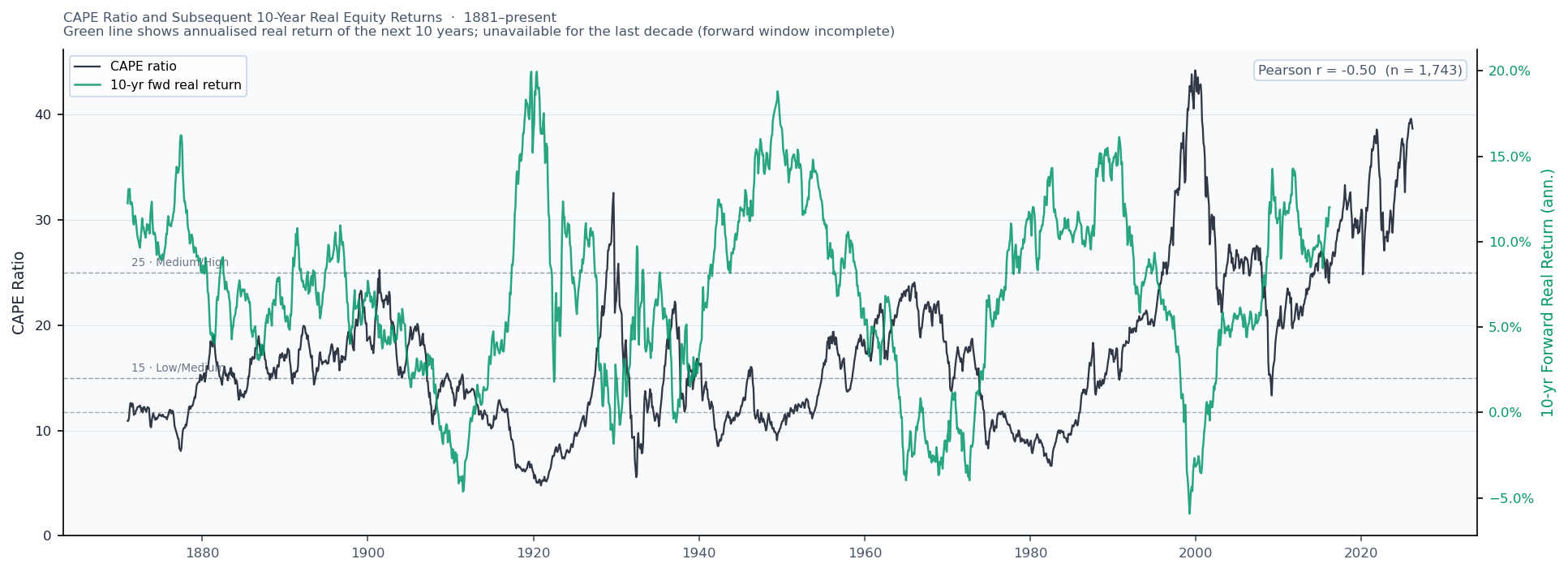
The three previous episodes where CAPE spiked above 25 each preceded a difficult decade for equity investors: the Great Depression (post-1929), the stagflation of the 1970s (post-1966), and the "lost decade" of 2000–2010 (post-dot-com peak). Retirements starting in those windows appear as the hardest scenarios in the simulator. What that implies for the current retiree ... is uncertain, but admittedly disconcerting.

CAPE Adjustment Is Approximate

The CAPE-adjusted success rate filters historical scenarios to those with similar stock valuations to today, using three buckets: Low (CAPE ≤ 15, ~45% of history), Medium (15–25, ~42%), and High (>25, ~13%). Because the High bucket covers relatively few historical episodes, the CAPE-adjusted estimate is noisier than the overall rate. Treat it as a directional signal, not a precise number.

Taxes Are Not Modeled

The simulation does not model income taxes, capital gains taxes, required minimum distributions, or estate taxes. In practice, these can meaningfully affect the amount available for spending. The withdrawal amount you choose should include any taxes that are due.

Only the Portfolio Is Simulated

The simulation does not model healthcare costs, long-term care needs, inflation in specific expense categories (medical inflation often exceeds general inflation), changes in spending in response to health or lifestyle, or the risk of cognitive decline affecting financial decision-making. These are all real retirement risks that a comprehensive plan must address.

Glossary
CAPE (Shiller PE)
Cyclically-Adjusted Price-to-Earnings ratio. The price of the S&P 500 divided by average real earnings over the past 10 years. A high CAPE historically precedes lower future returns; a low CAPE precedes higher returns. Developed by economist Robert Shiller.
Safe Withdrawal Rate (SWR)
The maximum fixed annual withdrawal (as a percentage of starting portfolio) that would not have caused bankruptcy in any historical retirement period. The "4% rule" is the most famous SWR benchmark, derived from 30-year US retirements in the Bengen (1994) study.
Sequence-of-Returns Risk
The risk that the order of investment returns matters. A bad market in the early years of retirement — when the portfolio is large and withdrawals are being taken — does permanent damage that a bad market in later years does not. This is why early retirement is particularly vulnerable to market crashes.
Real vs Nominal
Real values are adjusted for inflation and represent constant purchasing power. Nominal values are not adjusted. All dollar amounts in this simulator are real (inflation-adjusted) — a $60,000 withdrawal means $60,000 in today's purchasing power throughout the simulation.
Success Rate
The percentage of simulated scenarios that did not end in bankruptcy or trigger a reverse mortgage before the simulated death date. Higher is better. Mortality-weighted, meaning scenarios that only fail after an improbably long life contribute less to the failure count than scenarios that fail early.
Bond Tent
A dynamic allocation strategy where bond holdings are increased leading up to retirement (reducing sequence-of-returns risk), then gradually reduced again in early retirement as the portfolio stabilizes. Named for the tent-like shape of the bond allocation over time.
Glide Path
The scheduled change in asset allocation over time. Target-date retirement funds use a glide path that automatically shifts toward bonds as the target date approaches. In this simulator, you can define your own custom glide path.
VPW (Variable Percentage Withdrawal)
A withdrawal strategy that draws a percentage of the current portfolio, with the percentage increasing as you age. Designed to deplete the portfolio roughly to zero at your life expectancy, maximizing lifetime spending efficiency while still adapting to market performance.
Guyton-Klinger Guardrails
A rules-based withdrawal strategy that starts from an initial dollar amount and adjusts it annually based on two guardrail rules: the Capital Preservation Rule cuts spending when the portfolio has shrunk enough that the withdrawal rate is dangerously high; the Prosperity Rule raises spending when the portfolio has grown enough that the rate has fallen well below the starting level. Adjustments are capped so spending can never exceed the original amount.
COLA (Cost-of-Living Adjustment)
An automatic annual increase in a payment to keep pace with inflation. Social Security payments are COLA-adjusted by law. In this simulator, a COLA-adjusted cash flow maintains its real purchasing power throughout retirement; a non-COLA cash flow loses purchasing power over time as inflation erodes its nominal value.
Reverse Mortgage
A loan against the equity in your home, typically available to homeowners aged 62 or older, that does not require monthly repayments. The loan balance grows over time and is repaid when the home is sold (usually at death). In this simulator, it is modeled as a simple one-time lump sum of 40% of home value when the portfolio first reaches zero.
Actuarial Mortality Table
A statistical table giving the probability of dying at each age, derived from large population studies. Used in this simulator to generate realistic retirement durations — rather than assuming everyone lives to 95, each simulated path ends at a death age drawn from the mortality distribution for your starting age.
Historical Backtesting
Evaluating a strategy by applying it to past historical data. This simulator uses backtesting over approximately 150 years of US market history to see how a given retirement plan would have performed across all historical market environments.